
Start with the grain: browse wood-look laminates
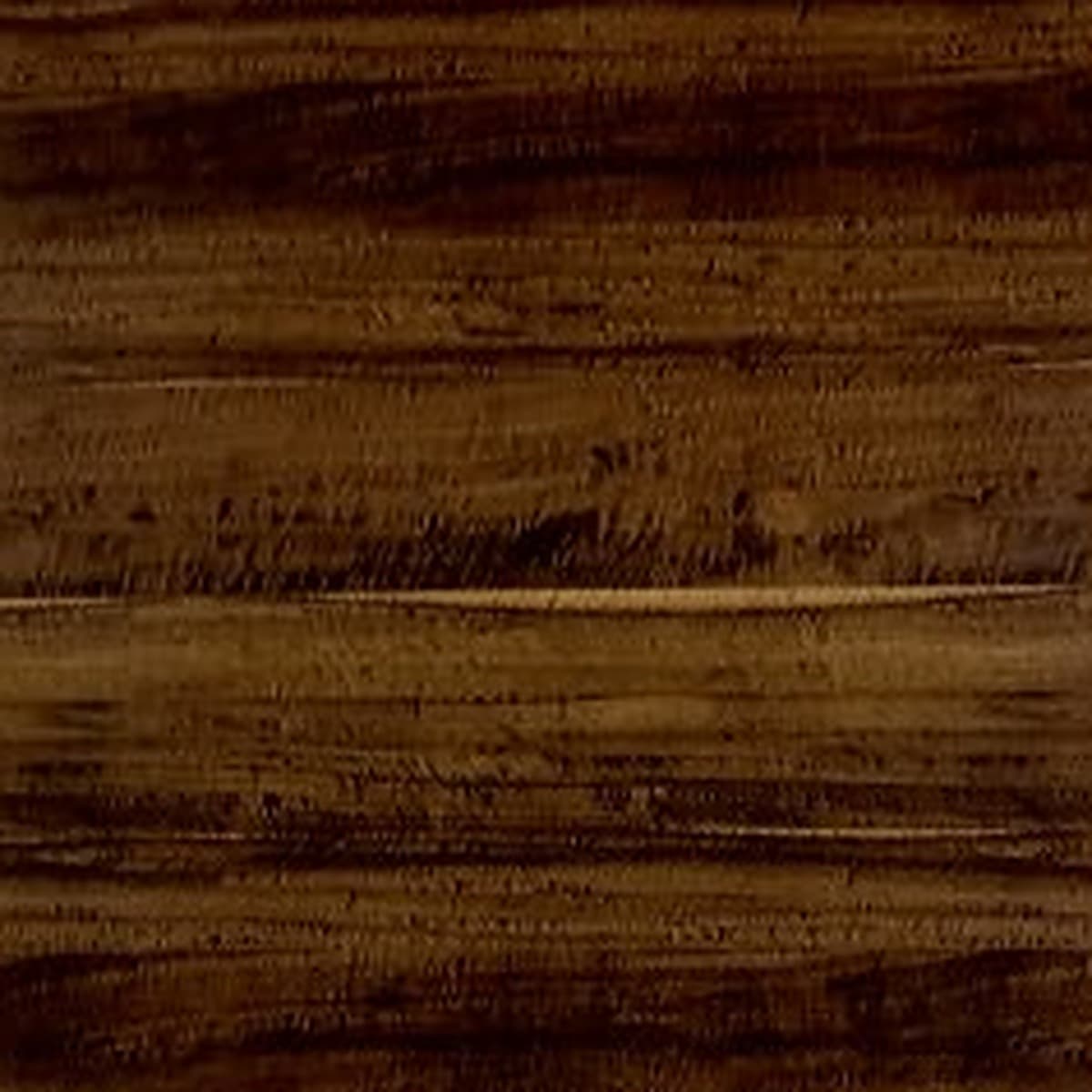
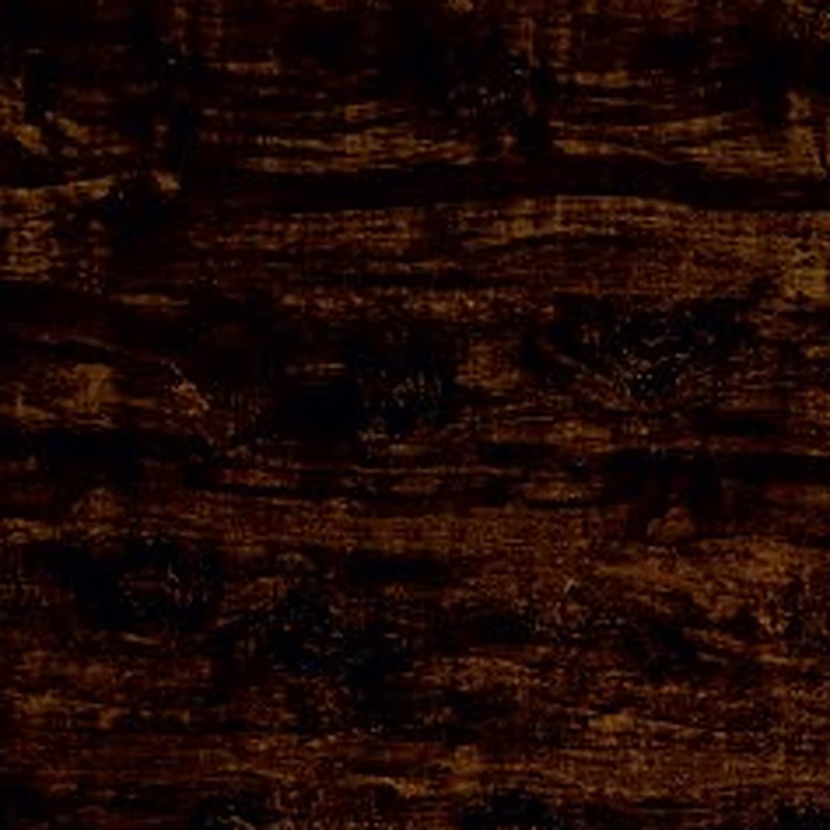
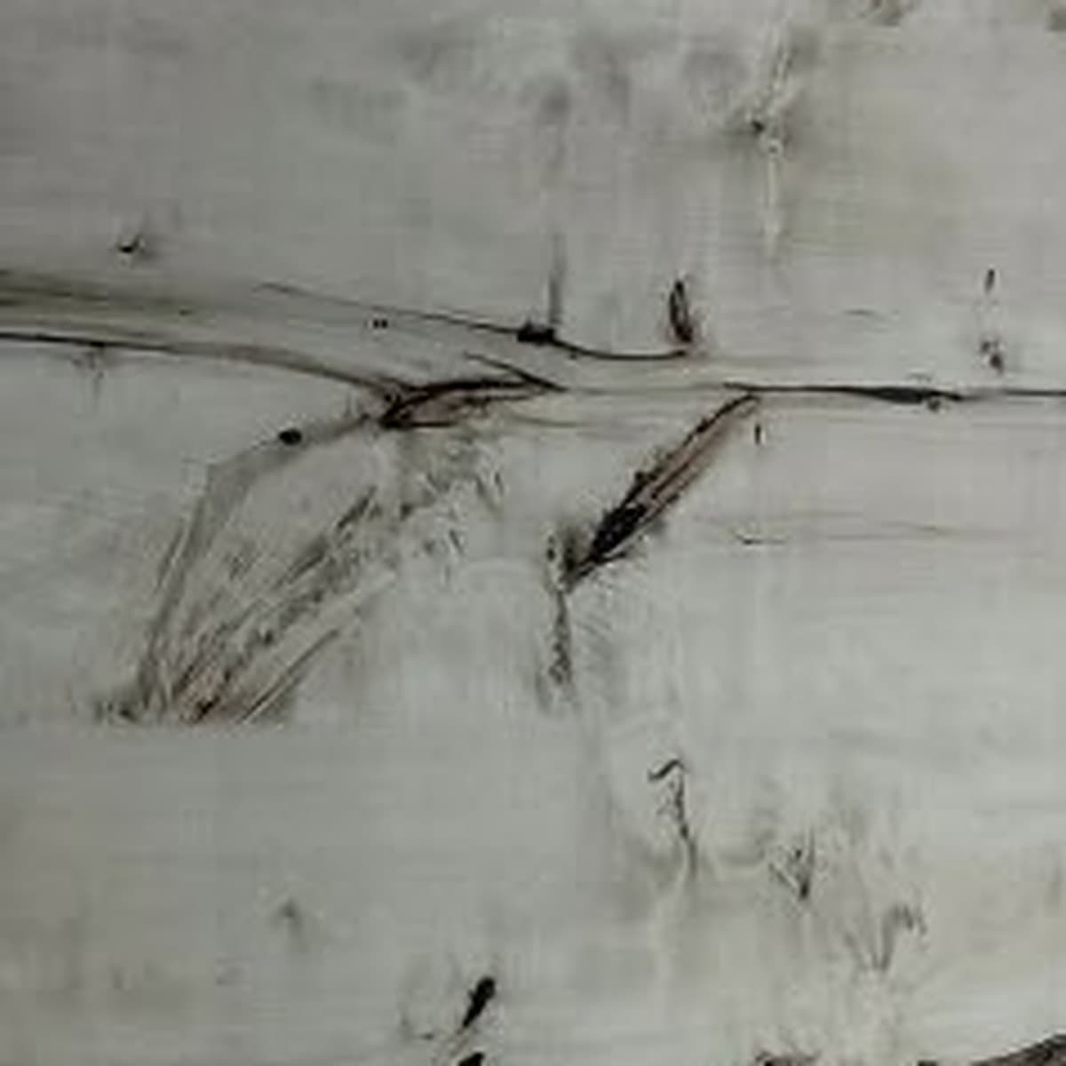
A palette that feels like home
You might love a wood finish in the showroom and still wonder what to put beside it. Should the wardrobe match the floor? Will a pale cabinet look washed out? And how much pattern is enough?
These three pairings offer a place to begin: ivory with oak, taupe with walnut, and sand with stone. Each has a different mood, but all leave room for the furniture, fabric and everyday objects you already own.
Start with the part of the room you are keeping. That might be a warm tiled floor, a favourite cream sofa or a dark dining table. Put your laminate samples beside it before choosing anything else. It is often easier to build around one familiar piece than to choose every finish at once.
The category grids offer products to browse, not an exact shopping list for these palettes. Confirm the shade, texture and intended use of each shortlisted laminate from physical samples and product details.
- LightIvory + oak
- RichTaupe + walnut
- SoftSand + stone
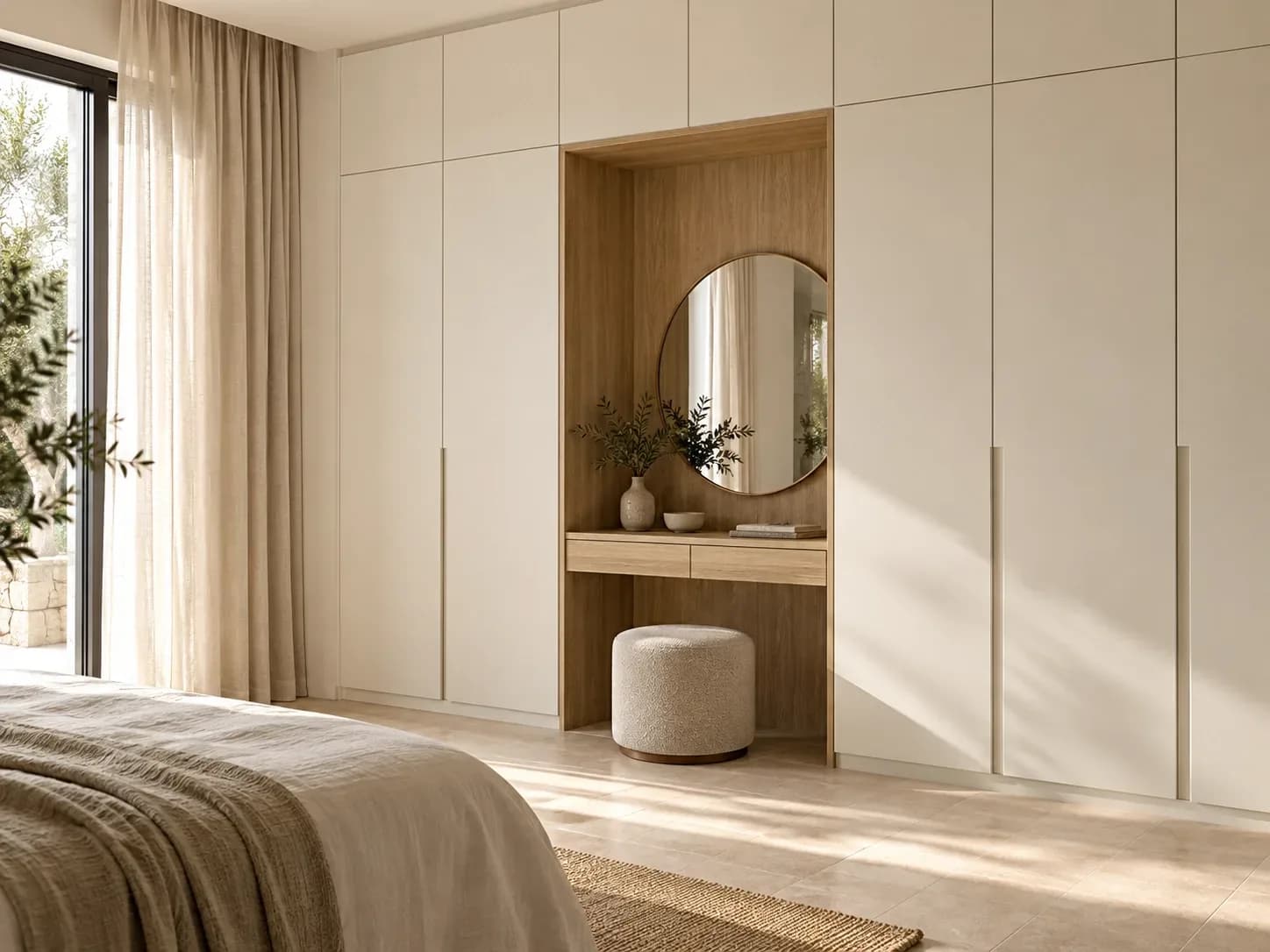
Ivory + oak / light, with a little warmth
Picture a bedroom with soft ivory wardrobe fronts and an oak-look dressing niche. The pale doors keep the composition quiet; the grain gives your eye somewhere to rest. Linen curtains and a warm off-white wall would complete this direction without adding another strong pattern.
Try it here: a wardrobe, study corner or compact living-room cabinet.
Keep the balance: let the solid colour cover the larger area and use the oak look for an open shelf or recessed panel. Compare the sample with your floor first, especially if that already has a prominent wood grain.
Taupe + walnut / depth without the drama
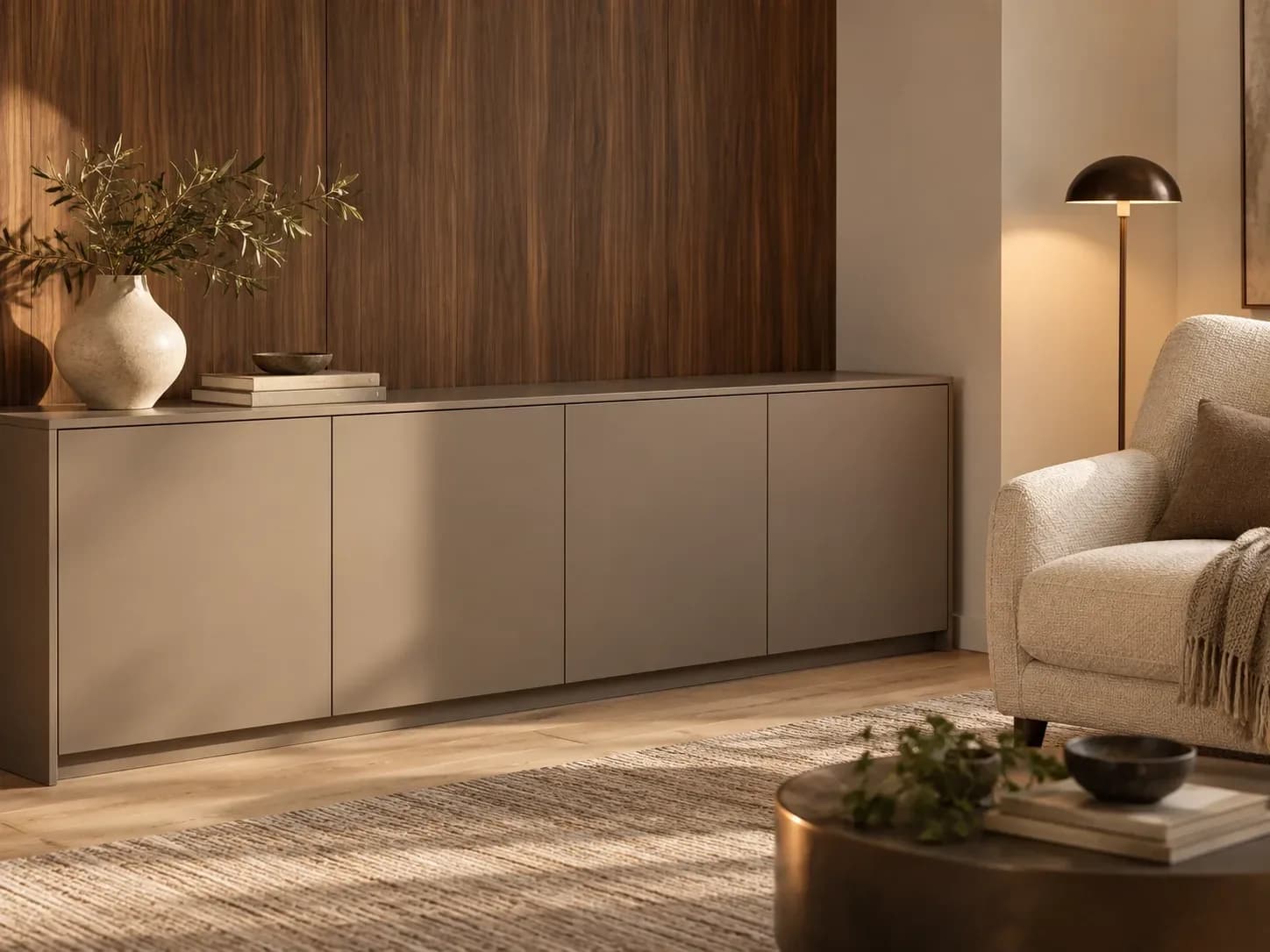
For a more intimate mood, pair a warm taupe solid with a walnut-look laminate. Imagine a long taupe sideboard with a walnut-look back panel, a softly lit reading corner and a cream upholstered chair. It has richness without needing every surface to compete.
Try it here: a home office, media cabinet or dining-room sideboard.
Keep the balance: choose one continuous grain direction for the feature and leave neighbouring doors plain. A small brass or dark-bronze detail can finish the scheme. If your room already has dark flooring, try the walnut look on a smaller area before committing to a full wall.
Sand + stone / a softer statement
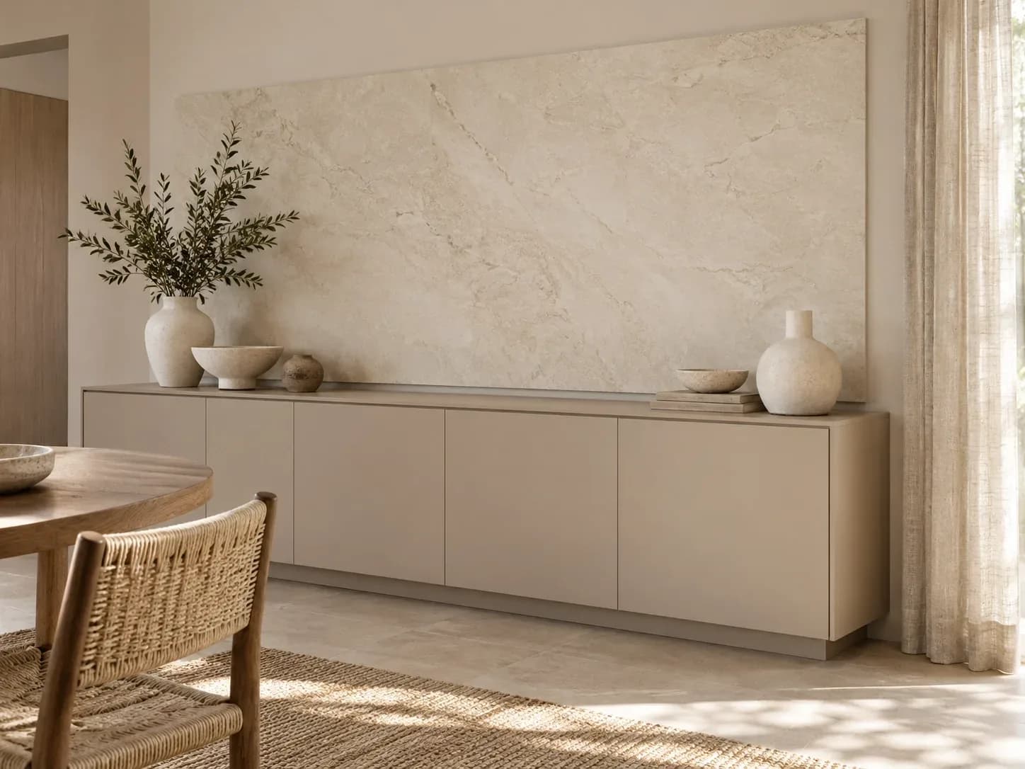
A sand-coloured solid and a softly patterned stone-look laminate make a quieter alternative to bold marble veining. Picture a dining console with plain sandy fronts and a pale stone-look feature panel above it. Rounded ceramics and woven fabric would bring a softer note to the straight cabinet lines.
Try it here: a dining console, entrance cabinet or living-room display niche.
Keep the balance: reserve the pattern for one focal area. Look at a larger design image as well as the sample, so you understand how the pattern repeats. Stone-look laminate describes the appearance; it is not a slab of natural stone.
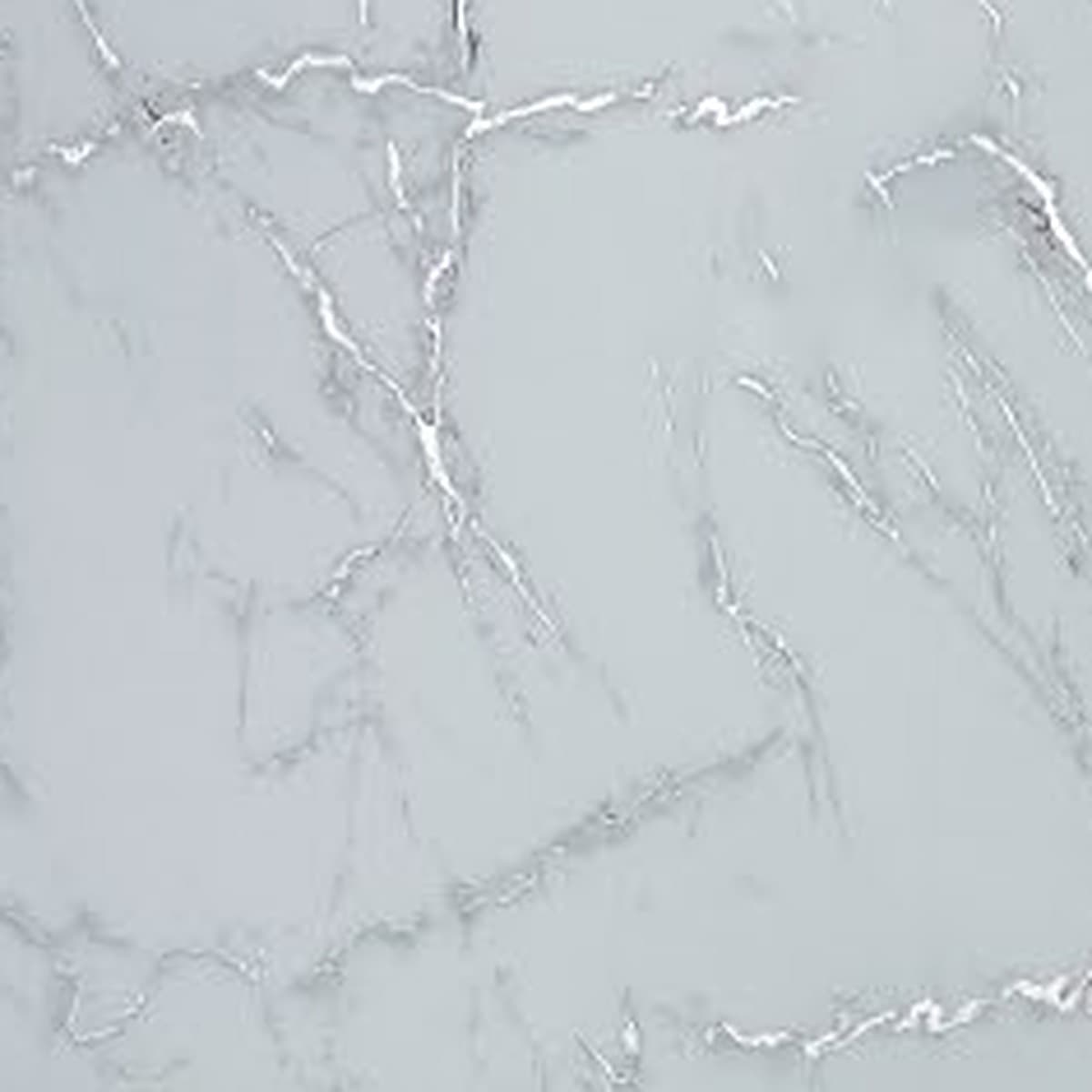
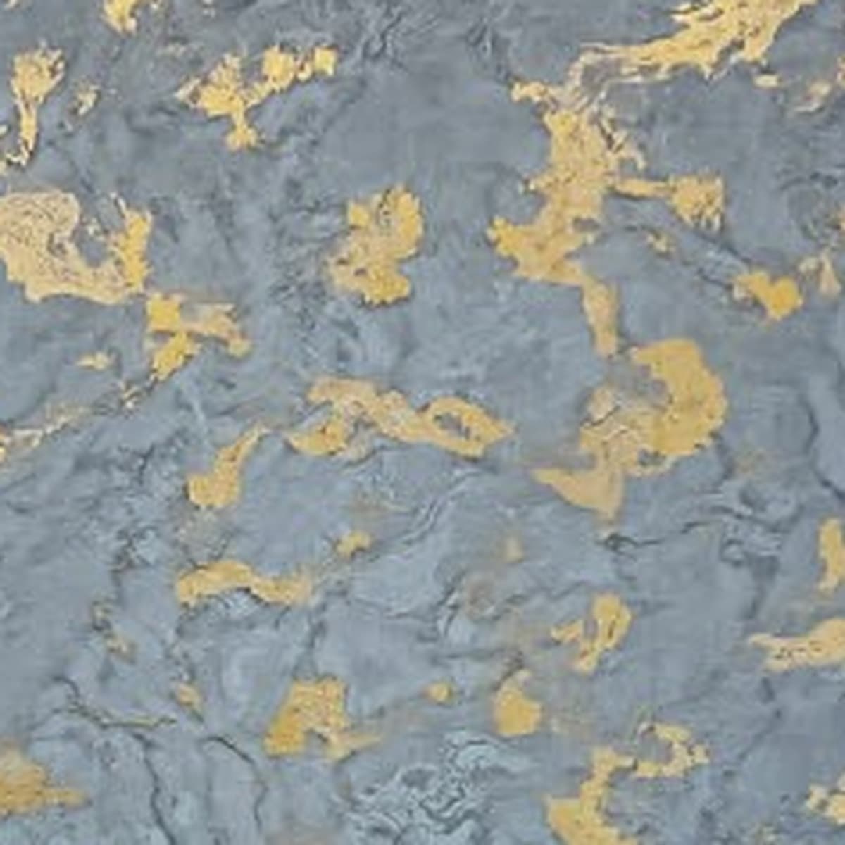
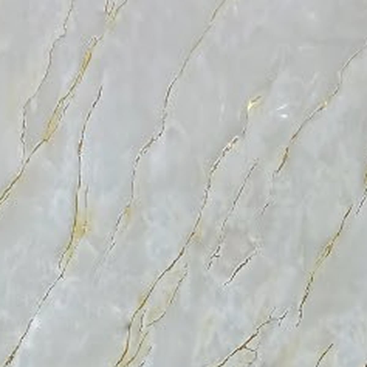
Explore marble and stone-look laminates

Bring the samples into your room
Put the pair together. Hold both laminate samples against your wall paint and beside the floor. Check them in daylight and under the lights you use in the evening.
Stand them the way they will be used. View a door sample vertically and a desktop sample horizontally. Look at the grain direction and the reflections, not just the colour.
Choose the finish deliberately. A matte and a glossy version can give the same palette a different character. Our matte versus glossy laminate comparison helps you think through that choice.
Write down the final specification. Record the design code, finish, thickness and edge treatment with your installer. A mood board sets the direction; the specification makes the order clear.
Keeping your existing furniture while changing the palette? Read what to check before resurfacing it with laminate before choosing the final combination.
Questions people ask us
Do I need the same laminate in every room?
No. Repeat one element, such as a warm solid colour or a wood tone, and vary how much of it you use. That can connect the rooms while giving each space its own character.
Can I choose the final shade from a room image?
Use the image to choose a direction, then check physical samples. Lighting, screens and surrounding colours affect how a finish appears. Confirm the product code and finish rather than ordering from a colour impression alone.
How do I stop a neutral room feeling flat?
Vary the textures and the scale of the surfaces. Pair a plain cabinet front with a wood-look niche, woven upholstery or a softly patterned feature. Leave some areas quiet so the chosen detail has room to stand out.
Which neutral should I choose when the floor is already warm?
Compare a few solid colours beside the actual floor instead of choosing by name. Cream, beige and warm grey can have different undertones, so check the full combination under daylight and evening lighting.
Where should the wood-look accent go?
Choose one area that deserves attention, such as a desk, open niche or console front. Keep the surrounding surfaces quieter and review the grain direction on the drawing before the sheets are cut.
Shop these categories
- 1 mm Decorative Laminates
- Wood Laminates
- Laminates
- Matte Finish Laminates
- Solid Colour Laminates
- Glossy Finish Laminates
Keep reading
- AnswersCan you use laminates over existing furniture?
Keep the furniture you like, but check the old surface before choosing its new finish.
- ProjectsA calm study corner: a laminate design concept
A concept study in warm wood-look laminate and soft neutral storage, ready to adapt to a real room.
- CalculatorsWardrobe laminate calculator: turn measurements into a plan
Measure the right surfaces, understand the estimate and take a clearer brief to your carpenter.
- BrandsMerino laminates: find the finish that belongs in your room
A considered way to choose Merino designs, compare samples and keep the final specification clear.
- CareHow to keep your laminates looking beautiful
A soft cloth. A gentle routine. Small habits that keep the finish you chose looking its best.
- CompareMatte vs glossy laminates: find your kind of luxury
Soft, understated surfaces or a polished glow? Find the laminate finish that feels right in your home.